
Matt Roeser has an innate sense of curiosity about everything...
WRITTEN BY: Philip Meissner
August 1st, 2011
I'm consistently fascinated by the next wave of young book designers out there. Some, like Jim Tierney, have shown us that you can land a great job at Penguin Books straight out of school if you have a certain type of passion for the printed word. Others, like Matt Roeser, take a different route. Matt is already successfully employed and working in graphic design, but has taken his passion for books in a direction that is nothing short of innovative and forward-thinking. With the launch of his blog, New Cover, he has built a terrific portfolio of "mock" book covers for some of his favorite authors. I have often told young designers eager to launch into “the industry” to do the very same thing Matt has done. The book design industry is thick. There are many gates to pass before you can expect to work with any number of prolific and game-changing book designers. But I really feel that what Matt is doing can really make a great impression in the industry.
For me, it has been a long road of blogging, emailing, phoning, and making personal visits to various art directors. And even after 12 years, I am still struggling to open some of those doors, let alone have those art directors/publishers I admire actually take notice and give me the opportunity to work with them. So, all I can say is "Bravo!" to this new breed of book designers. They are young, endlessly skilled and talented, and have much to offer to the future of great book design. Ladies and gentlemen, I give you Matt Roeser.

Tell me a bit about your childhood, where you grew up, and whether or not art figured into your developmental years.
As I child growing up in St. Louis, Missouri, I spent most of my free time drawing and reading. So at a very early age, I developed a passion for stories. I remember the first “big person” book I read at age 10: Jurassic Park. It was right when the movie came out and I was just in love with it. But I also think it was the first time I looked at a book and acknowledged how cool cover art could be. Chip Kidd’s T-Rex silhouette is still one of my favorite covers to this day.
Give us a little background on how you got into design. Where did you study?
Throughout middle and high school, I was always most excited by the classes that really played to my creative outlets, whether it be advertising, website design or creative writing classes. So when college rolled around, I knew I wanted to go into a field that would allow me to be creative. Initially, I went to Saint Louis University for marketing. It didn’t take long for me to realize that this was not a course of study I was going to enjoy, and I soon asked myself, “What am I doing?” So I switched to the Communication Department at SLU, where I proceeded to take pretty much every class that would give me a new perspective on what I wanted to do. It was there that I started to hone my design and thinking skills, and understood how powerful the combination of the two is.
You work at Atomicdust. They do some nice corporate and advertising work. Where do you figure into the design process there and do you find that doing that type of design work informs your book cover projects?
At Atomicdust, I’m senior designer and lead a team of five designers. Because we’re a small agency (a total of 14 people) everyone wears many different hats. For someone who thrives on new challenges, this is perfect for me. A designer’s role there involves participating in every aspect of our process: from the initial research phase, to taking everything we’ve learned and molding it into a simple message, and then relating that message to the audience in a variety of mediums. I have an innate sense of curiosity about everything, so I really like immersing myself in whatever industry our clients work in. So, while it’s a more prolonged process than doing a book cover, the core idea of taking a lot of information and boiling it down into a simple, clear visual that gets across a tone, look, and feel, is still the same.
How did you decide to start New Cover, your blog where you post "mock" covers for books you would like to design?
Because of my passion for reading and design, it seemed like an obvious choice for me to blend those two together. I’ve secretly always wanted to do book cover design, and finally decided to take action towards my dream job.
You state on your blog that you hope to have the opportunity to see one of your “creations gracing a novel at (your) local bookstores“. Is that the goal of the blog, to use the work you do there as a springboard to a career in book design?
Absolutely. I realized that people weren’t just going to hire me to do a cover if I had no prior work to show them, so, in a way, New Cover was serving as a creative outlet, and as a portfolio-builder.
Your work is fun, different and above all, something I would expect to see on a shelf at a local bookstore. What's stopping you from making it a full time thing?
Nothing really at this point. For the past few months, the blog and my designs have gotten some nice feedback from various design blogs, local TV and newspapers, as well as several people within the cover design industry. New Cover has attracted the attention of literary agent Luke Janklow as well, which resulted in my first big cover, Machine Man by Max Barry, which will be in bookstores August 9th. So I’ll finally get to go in and see one of my designs. I’ve got several other projects currently in the works, so it’s all very exciting and sort of surreal.

Who are some of your favorite Publishers/ADs that you dream of working with?
I think Penguin does the most consistently amazing work, taking care to give each title a beautiful look and feel. They really look at all of the details and you can just tell that they respect the exterior of the book as much as the story it contains within. Paul Buckley’s not messing around. Others include: Peter Mendelsund and John Gall at Random House, Archie Ferguson at HarperCollins and who doesn’t want to work with Chip Kidd?
What strengths do you feel you have that would put you at the top of the list for getting hired by great publishing houses that you admire?
I think one of my strongest talents is creating a cover that has meaning behind it. Whether it’s something the reader doesn’t get right away or realizes after they finish the story, I like the idea that there’s more to the cover than just what you’re seeing.
Where do you see your career culminating? Would you be happy ending up at Penguin or Random House, or are you shooting for Art Director or studio manager?
My ultimate goal is to keep creating covers that make someone stop and want to pick up the book. So whether it’s at Penguin, Random House, freelancing, or wherever, as long as I get to be constantly challenged with that next title, I’ll be happy.
Your cover work is extremely versatile to say the least. Do you primarily use stock that you alter, or is it all your own illustration work?
It’s a mixture of both. Where I feel my illustration talent shines the best is in the arena of vector art, more simple and clean shapes. More realistic drawings/paintings is something I’ve never been very skilled at and is better left up to the professionals. There are so many artists, designers, and illustrators that I follow on Twitter that are constantly doing amazing work, and that always pushes me to make my next cover better than all of my previous ones.
Who do you feel is doing truly phenomenal work these days. This is your chance to shed light on some unknowns, as well as people you truly admire that we’re all familiar with.
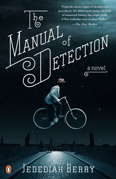
gray318 never disappoints. I have several favorites that consistently delight me with their work, including: Henry Sene Yee (his Kavalier & Clay cover is still one of my favorites), Jim Tierney, (I hope one day his Jules Verne thesis project gets printed), Jen Wang (who does amazing things with handwritten type), and Tal Goretsky (his paperback of Manual of Detection is one of my absolute favorite covers, not to mention Moonwalking with Einstein). Also, Michael Gillette is the reason I shelled out quite a few dollars buying the complete UK hardcover collection of James Bond novels. They are works of art! Also, while not in the specific realm of cover design, have you seen the artwork of Andrew Lyons? Beautiful! We’re in early talks on collaboration for several cover ideas which I am very excited about.
Do you have a genre that you especially enjoy designing for?
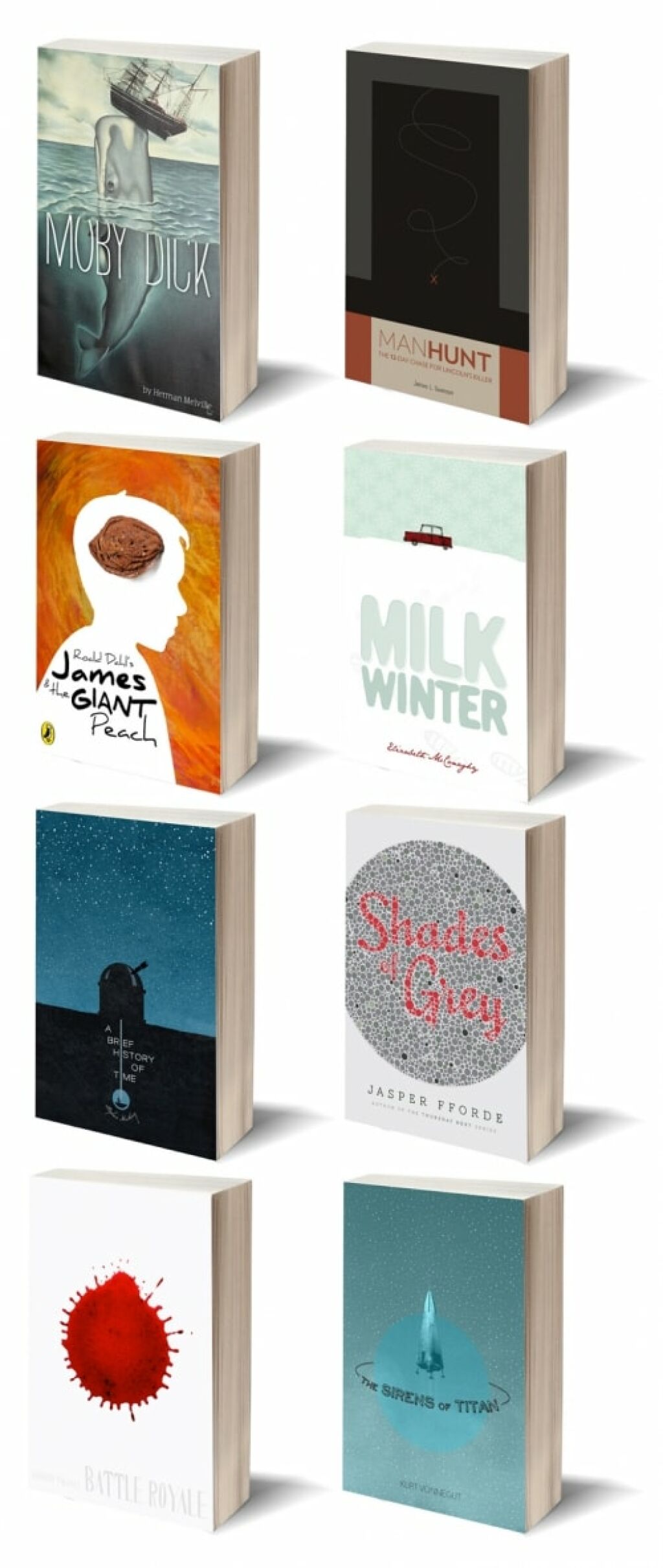
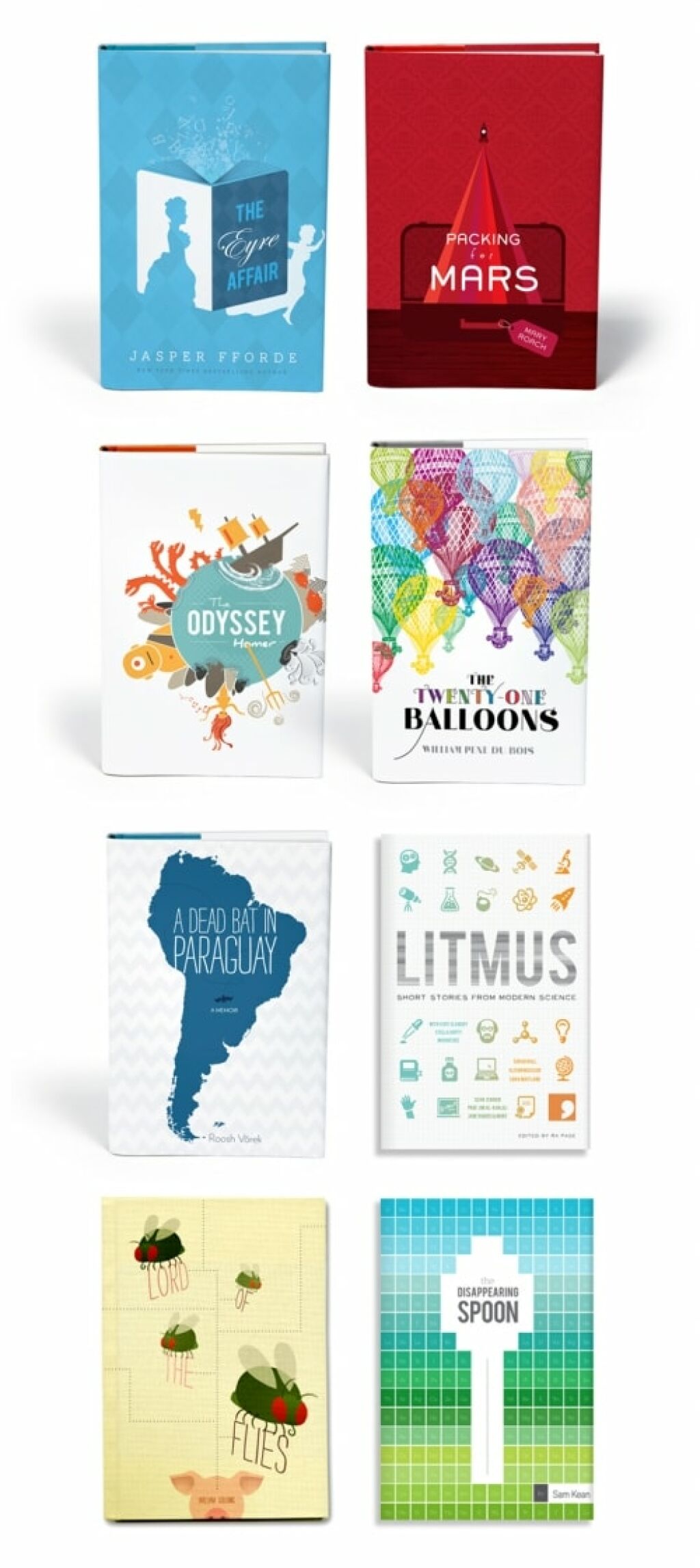
Not particularly. On New Cover, I’ve done a wide range of books, from the classics, fiction and non-fiction, and several children’s titles. I like the challenge each title brings and am trying to not get tied down to one specific genre. In the future, I might find that I like one area over the others, but for now, anything goes.
What are some of your favorite covers that you have done and why?
That’s pretty tough…it’s hard for me to play favorites, but some have come out more as I envisioned them over others. If I had to choose, I always lean more towards the covers that have a strong idea behind them that ties into the book and lingers with you after you put it down. An idea that, upon first looking at the cover, you may not fully understand what it has to do with the story, but after finishing the book, you see it in a new light. I think two of my covers that succeed at that are Shades of Grey and Jonathan Strange & Mr. Norrell.
Shades of Grey takes place in a futuristic version of our world where social class is determined by one’s ability to perceive a particular color. In the book, when a person turns 20, they take the Ishihara test to determine how high of a percentage of a color they can see (the more you can see, the higher your rank will be).
Because the Ishihara is an actual test created to determine color-blindness, I used that as the basis for my design, having the title appear in red (as the main character sees) among a sea of grey. So, while someone who hasn’t read the book can still get the idea of a color-based theme to the story, those that have completed the book more fully understand how it ties into the tale.
Likewise, with Jonathan Strange and Mr. Norrell (an amazing novel about two feuding magicians in 19th century England), I wanted to play with the idea of the two strong personalities of these men. Because they’re always trying to one-up the other, I decided I would make dual covers. Each cover showcases one of the magicians, with the other being just out of the frame (and their name considerably smaller), allowing readers to decide which character they prefer.
Name some favorite authors that you would love to design a real book cover for?
Through New Cover, I’ve gotten to pick a few of my favorite authors that I would love to work with, including Kurt Vonnegut, Roald Dahl, and Jasper Fforde. I’ve been fortunate to have some of the (still-living) authors I’ve done fake covers for comment on my work. Jasper Fforde liked my Shades of Grey cover and asked if he could print it on postcards that he hands out at his book signings, so that sort of blew my mind. And Lemony Snicket author Daniel Handler wrote me a nice email about the adult covers I created. Mary Roach and Bill Bryson are two of my favorite non-fiction authors that I would love to work with.
Lets discuss your process a little. Do you work primarily on the computer or other mediums? When do you know when you've nailed it—seeing as you don't have the constraints of an Art Director and


