Taking Your Book Layout From Good to Great
Your book's interiors should be as great as your cover. We'll tell you what you should be looking for and how to get there.
WRITTEN BY: Ian
July 27th, 2021
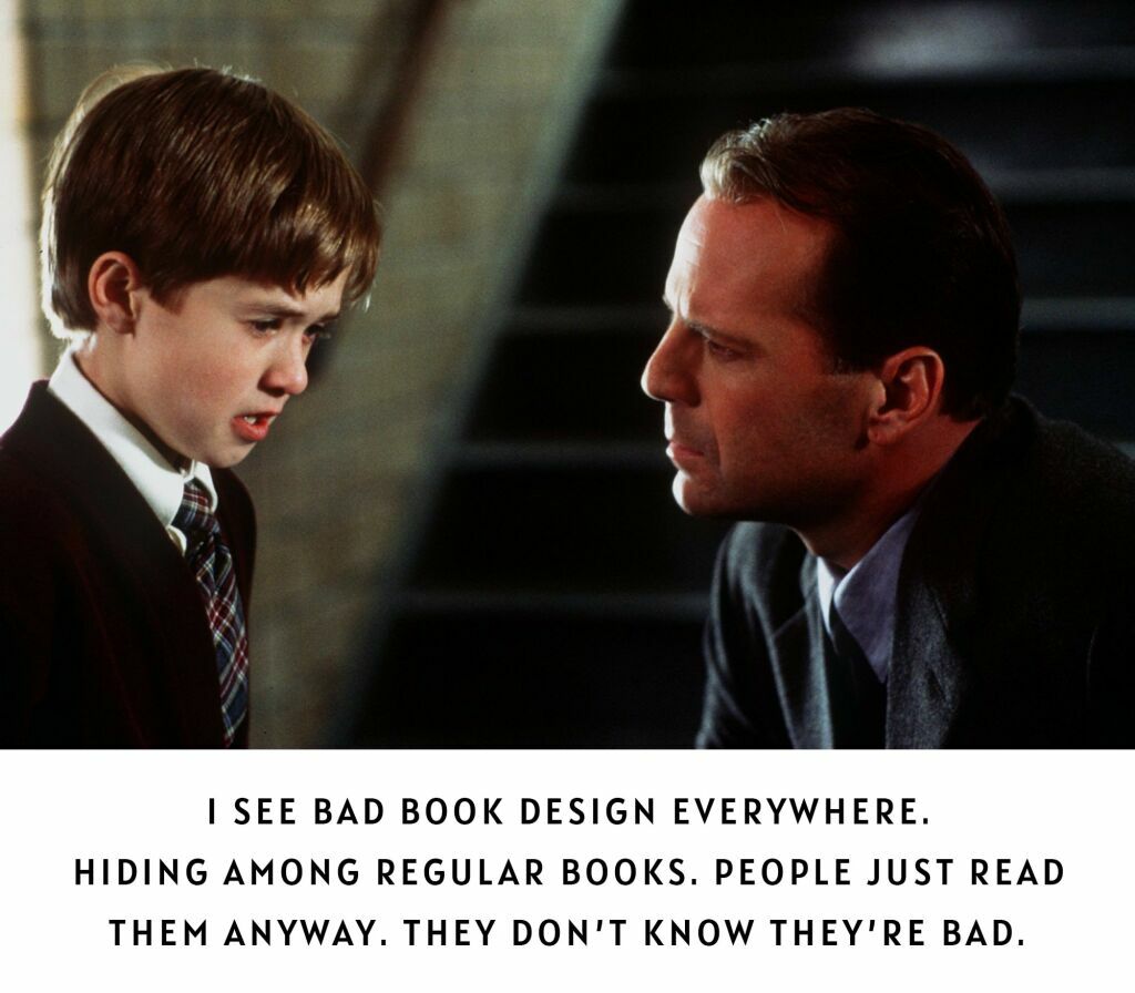
We often hear in the book design industry that a good book layout design should be "invisible." What that means is that there should be nothing about the reading experience that detracts from the intended purpose of a book: to be read.
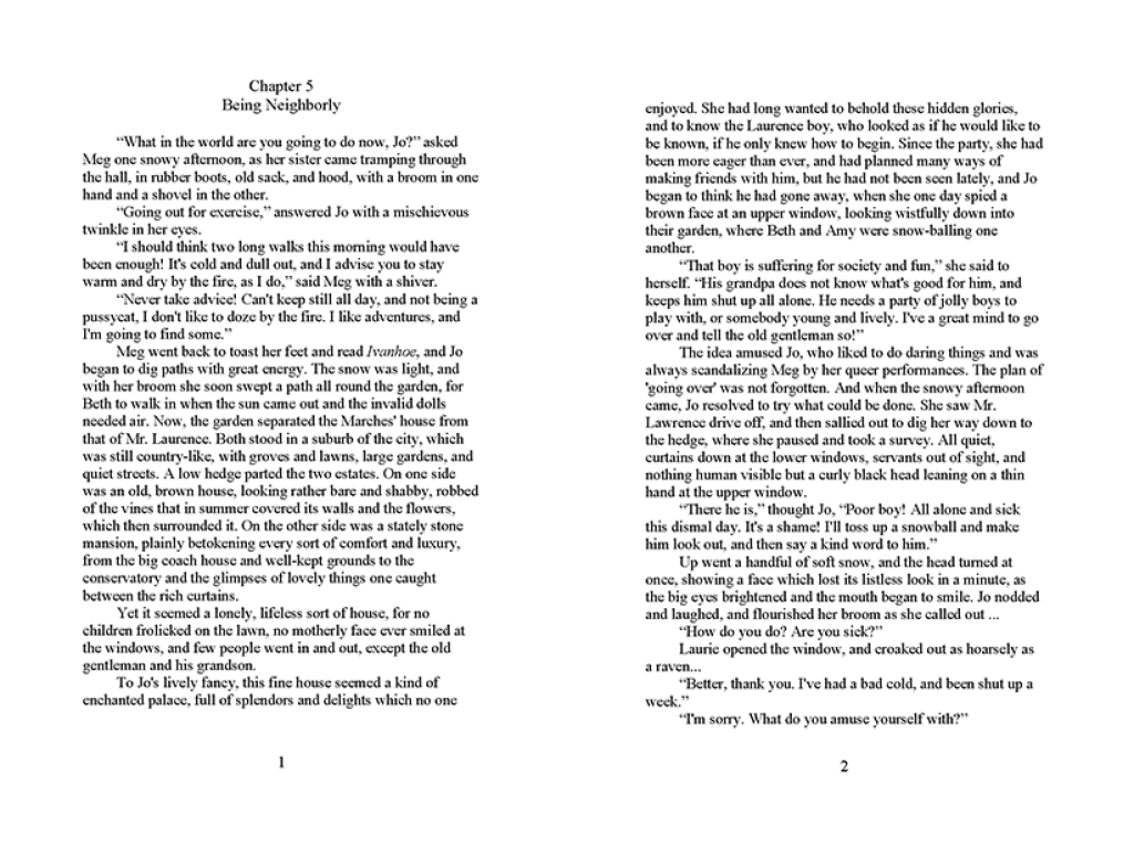
In the following example, we see that basic idea at work. The look is simple and uses minimal "design." There may be some small ornamental features to add to the mood of this historical fiction novel, but its success is hinged upon its lack of gratuitous design features. To the reader, it's clear when a chapter ends and starts or when a section breaks as well as what page they are on or chapter they are reading. The text is at a comfortable reading size, hyphenations are to a minimum, and the text flows from edge to edge (justified text).


That said, there are many types of interior layouts and book types: children's books, young adult books, illuminated manuscripts, illustrated books, photography books, architecture/technical books, business books with charts, graphs and tables (The example here isn’t really a business book—it’s college prep for musicians and there’s only one chart.), as well as books that required sidebars, pulled quotes or special attention to line breaks, as in poetry books and so forth. In some cases, there is ample room for "design," in the sense that much can be done to enhance the reading experience and give depth to the overall visual experience of a read. Other times, it's important to focus on clarity, simplicity, and readability. In fact, it can be argued that regardless of all the moving parts a book may have, its top priority is readability and logical structure/hierarchy of content.
In these examples, we see more complex design treatments that pair well with the subject matter…


While in the following examples we can see the notion of "invisible" design at work, don't be fooled, there is a lot of design going on here as well. A designer is making a deliberate choice to create appropriate margins, use the negative/white space to create focus, and choose fonts that are appropriate for the topic. The designer is still paying attention to typographic rules, proper font pairings, and hierarchy to create consistent visual flow and logical order and structure to the reading experience. At the same time, they are recognizing it's best to let the clarity and accessibility of the text be of top importance.


How hard can it be?
Oftentimes authors make the assumption that we will basically be cutting and pasting their text into the book layout. Yes, that does happen. But prior to that taking place, there is a laundry list of things we need to do:
1. Make sure your manuscript is fully edited/proofread and ready for layout. Most book design studios can direct you to editors they can vouch for, but otherwise, there is no shortage of good editors online.
2. Create sample page designs, usually showcasing a treatment for a Title page, Table of Contents, Front matter (i.e., Preface, Introduction or a Foreword), as well as a sample design for the first chapter or so and any major elements like image treatments, caption treatment, sidebar and other elements that may affect the flow of the text of the book. Then get those approved by the author/publisher before laying out the entire book.
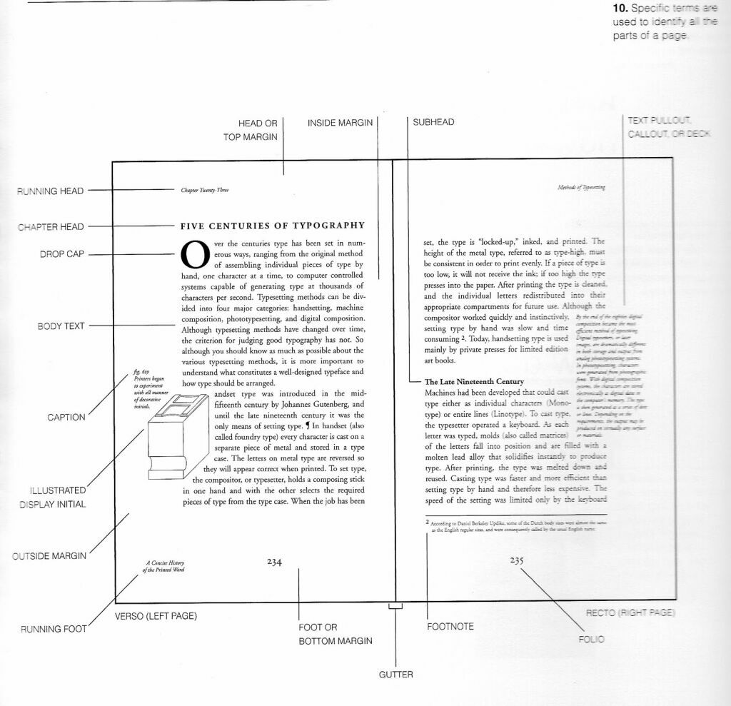
Here we see a typical selection of chapter openers, table of contents, and general text flow design samples. A designer will present you with these prior to beginning the full book design to make sure you are comfortable with the size of the text, and treatment of other major components of your book's content. They may show examples of different ways to treat a table of contents, chapter, part and section openers, and images, charts, graphs, and tables to name a few. It's important to see how all of these things work together in concert and create a readable experience. You would be amazed how one small thing can affect the readability of a text: bad fonts, incorrect margin spacing, reading text line length, and placement of images within the text—all can stop a reader in their tracks and confuse them, make it difficult to read and distract unnecessarily.


During this stage of the design process, we present you with a sample that shows several things you should be looking out for: your book's trim size (the physical size of your book), margins (the distance from text to the edges of the page as well as possible use of columns), font, font size, typographic treatments (things like drop caps, italics, and bolded words), line length (how many words on average are fitting on a single line), space between lines of text, as well as possible treatments for part openers, chapter openers, section breaks and so on.
3. A page cast is then conveyed to the author to make sure it meets their requirements for the number of pages the book will have. This is also called a book's "extent." Knowing how long your book will be influences a few factors: printing cost (more pages = more expensive product), how thick your book's spine will be, and how heavy it will be as an object (less of an issue if it's just going to be an ebook).
4. All the images used in your book need to be print-quality. That means they need to be able to reproduce at the size they are being used in the book and not look pixelated and low quality
Can you spot the difference? It's not uncommon for authors to supply us with images they found online or pictures they’ve taken with their flip-phone camera. There are a few problems with this. First off, do you own the rights to print the image in your book? Secondly, it is likely an image that is at a very low resolution may be fine for online viewing, but not for a printed book. You can learn more about the specifics here, but suffice it to say, we will give you a heads up and let you know what we need, how we need it supplied, and when we will need it throughout the process.

Finally, only after we do all of this can we format the text of the entire book. At this stage, we will format it according to the approved design samples we showed you, and place all of the necessary images, sidebars, and any elements that need to flow with the book's text. After this, we present to you a "First Full Pass" of the whole book for your review. There may be other things but this is the basic gist. Your designer should communicate all of this and be able to explain the reason behind each of these things.
The Importance of a Good Book Layout
Legendary designers like Jan Tschichold spent a good portion of their design careers establishing the do's and don'ts of good book layout. To put it bluntly, a book can have a very pretty cover, but if the interior pages look like shit, it'll ruin the entire package and obviously the reader's experience. It's like going on a first date because you liked how someone looked and finding out they suck in every other way.
Nerd out on this…
There are many book-formatting services online. Beware of them. Know what to look for and what questions to ask. Some important things to know:
1. Ask for samples of layouts for books in your genre, i.e. self-help, business, coffee table, YA, fiction, etc.
2. Do the layout samples feel like they belong with the cover? In other words, is the designer picking up fonts used on the cover for the interior pages? Why is this important? It shows that they are trying to create a cohesive package.
3. How are they treating things like the table of contents, page numbers, running headers and footers and chapter introductions, part openers, images, captions and other components? Do these things look unique, elegant, or simply uneventful and boring? Even if it is boring, is it clean, easy to read, and easy to find content and access information on the page?
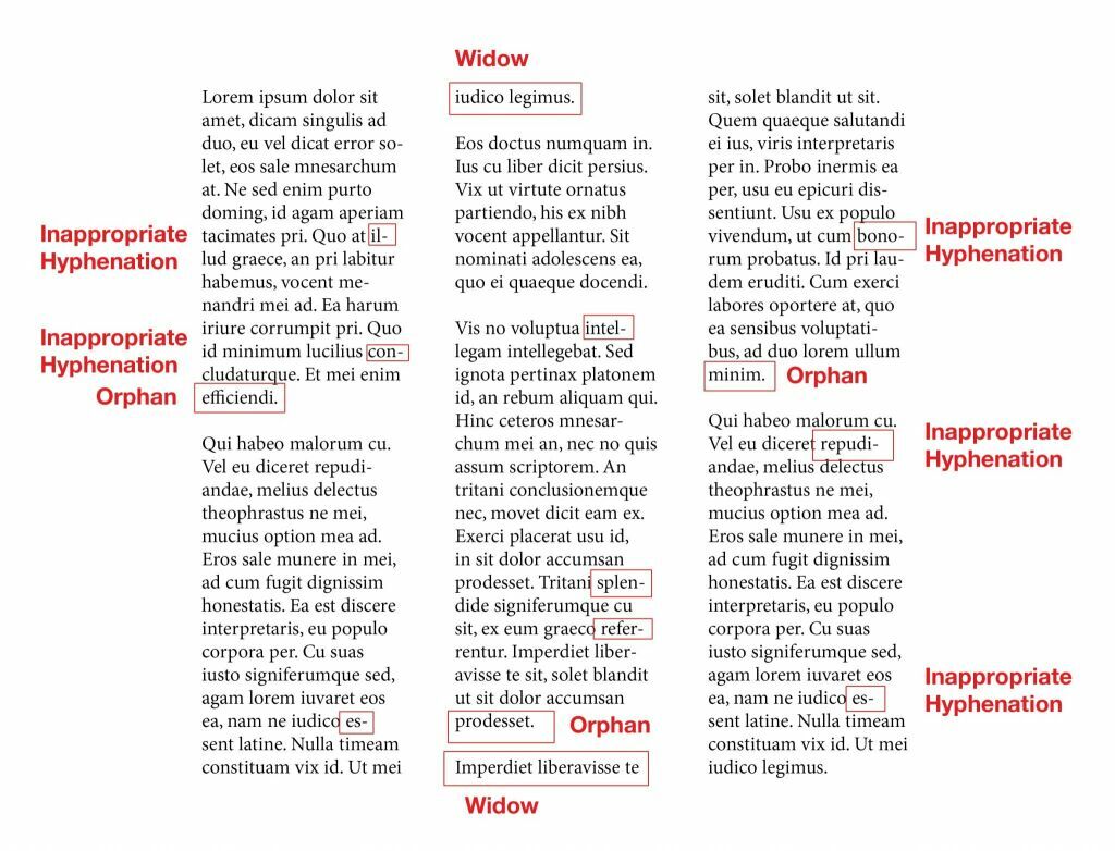
4. Are there a bunch of widows and orphans in the text? Widows and orphans (without getting too technical) are oddly hanging single words at the end of lines or starting on the next page. Basically, is there anything about the text flow that catches your eye as odd or off? If it does, think about how that will feel for readers when they encounter such issues over and over through the layout.
5. Are there too many hyphens?
6. Is the text too small or too big?
7. Are there ample margins around each text block? There are few things more annoying than reading a book whose margins are too small and all into the book's gutter (the gutter is where the pages are bound to the spine of the book). Does it feel like the text is about to fall off the page?
8. And finally, do all of the layout samples look the same? Many layout services offer a templated look that can get repetitive. Look for diversity. Variety is the spice of life. If everything a book designer does has the same basic feel, it means they are not approaching each project as a unique challenge. A book's layout and cover should strive to convey the author's unique voice. Bottom line, unless it's a design for a series, nothing should ever look the same as everything else. That's called being lazy.
Types of book layouts
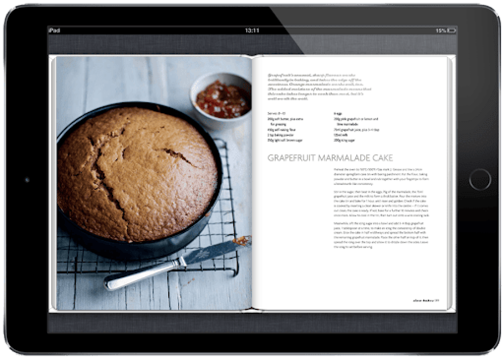
As discussed, there are many types of books. There are book layouts with very little text and mostly images with captions. Other layouts are all text or have many chapters, parts, section breakers and other components like sidebars, charts, graphs, tables and spot-art (small illustrations usually featured as chapter openers or to illustrate the text). There are books for kids and for older adults who have a harder time seeing and require a larger font, for example. All these things are important to discuss and know about your book.
Some books are very involved graphically and almost look like magazine spreads. The more dynamic and complex a layout design is, the more important it is to make sure all of your text is readable and not getting buried in the design.
Remember how we started this article stating that a book layout should be invisible. In other words, the design should not detract from the pleasure of reading. Of course, there are picture books where there is not that much reading, but again, are the pictures displayed in such a way as to encourage the reader to see them in their full glory? Or are the images placed in a distracting way that is hard to follow? Ultimately a designer is creating a visual narrative with your book. They are giving everything its proper context and order and structure.
In quoting your book layout project, most designers will want to know how many images you plan to have in your book, and whether they are going to be in full color or black and white. They might also need to get an idea of what your expected page count is going to be (the more pages to design, the more work for the designer), as well as a general word count and many other questions that allow them to plan your book design.
Below we have a wide selection of different types of book layouts. As you can see, there is no single approach to any given design. Some are very involved and visually rich in color and compositional complexity, and others are very simple and paired down.


A basic history of book design
The history of book layout design started likely in places like Asia. Most early books were some sort of religious manuscripts written on palm leaves or other early forms of paper or stone.
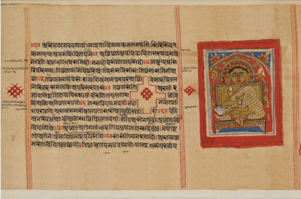
Illuminated manuscripts were hand-written and illustrated during the Middle Ages. Early methods of printing in the form of stamping or using etching and inking of assorted surfaces of wood and metal and pressed onto paper can be traced to medieval times but likely even earlier on pottery, fabric and pressed leaves and wood. There are many beautiful samples of pre-industrial printing and attempts at mass production of various texts. Even into modern times, the process of "designing" a book's pages was arduous to say the least.
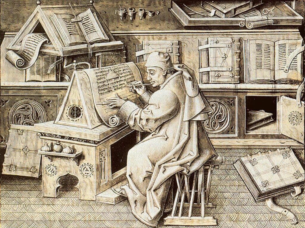
Methods involved using cast metal and wooden blocks to meticulously layout every single line of text for printing on assorted surfaces has been in some use since around 800 AD. To add to the difficult and time-consuming process, this was often done backward.
Take a moment to think about that…


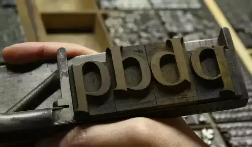
We get the terms “upper case” and “lower case” from when printers stored metal blocks of upper case letters on the top shelf of a case and the small/lowercase letters on the bottom, to not get them mixed up. The expression "mind your p's and q's" came about because printers had to set entire pages of text backward in preparation for inking and pressing. It was not uncommon to mix up the letters "p" and "q" since they looked so similar…
We can safely assume this was not a pleasant line of work. It's a miracle the average book designer didn't just off themselves after finishing a single page.


Benjamin Franklin and many other forward-thinking minds of the pre and post industrial era were eager to develop more practical methods of printing that would be less time consuming and more functional for mass production. With the perfection of modern-day printing devices, even the average person can mass-produce their book thanks to digital printing.
Today, we are no longer limited even by standard offset printing methods that still require plate making and a host of set-up requirements. Now we have print-on-demand (POD) companies that use digital printers which can print and bind a single book—instead of 100,000 copies that may end up never selling. Most indie authors and even larger publishers are now opting for print-on-demand as it's more efficient and practical and has a lighter ecological impact.
Moving to the future, ebooks and audio books are becoming more and more the norm. While bookstores still exist and publishers still spend money on beautifully printed books, it's very likely the printed book will go the way of the CD and VHS. We hope the nostalgia of holding a real book in your hands wins out over technological advances. Books are super cool!
Edit your manuscript BEFORE you start designing!
We can't stress this enough. It goes a long way in saving time down the road. We typically advise having several professional editors work on your manuscript. Only after doing this is your book ready for page layout design.
While most professional book designers will offer to make editorial changes and assorted design adjustments, it can affect a lot of things when you have too many editorial errors and the whole books is already laid out. Things like images shifting and text not starting and ending where it needs to can occur.
What to know about printing
Nowadays, most books will be printed using print-on-demand technology, which is what services like Amazon and Ingram Spark offer. The alternative to this is called web offset printing which is essentially a more traditional method of printing. We won't get into the specifics here, but suffice it to say, there are differences between traditional printing houses, specialty printing houses and POD services.
Traditional printers will usually have certain offerings that POD printers simply do not offer. They may offer certain printing finishes like gloss, matte, spot UV, embossing, foil stamping and assorted binding methods ranging from standard case-bound, perfect bound, cloth, to spiral binding and other stitching, gluing and even rivet methods that may be best suited to specialty projects. They will also offer things like dye-cutting (essentially cutting a hole in your book cover to reveal a page beneath it), deboss and emboss treatments as well as specialty inks like fluorescent, metallic, and custom colors not achievable with conventional methods.


Print-on-demand services will usually have a limited range of choices regarding book trim size (the actual size of your book) as well as paper types and printing finishes like matte and gloss and so forth. Because POD is so automated, there are usually many restrictions on how a page design is set up. Most POD services have their own rules and will alert you immediately if something does not meet their guidelines and suggest what needs to be done to correct it.
While this might sound off-putting, it is more affordable and works for pretty much 90% of publications. It may not be the best option if you are wanting a full-color book with many printing treatments throughout and some sort of fancy binding. But if you wrote a novel or a business book and need a black and white interior, POD is the ticket and will save you a lot.
POD has come a long way. There is more precision and quality control today than ever before and it just gets better. It is very possible that at some point if things don't move entirely into the digital realm, that these POD services will end up offering other options for paper, binding, inks, and finishing treatments. We’re crossing our fingers.
What about book design for e-publishing?
There are several file formats that are used for ebooks: ePUB, Mobi and PDF. A good design studio will produce all three. Some publishing services like Amazon will accept ePUB formats and others like Apple need a Mobi file.
Aside from this, you have two basic styles for an ebook: reflowable (the proffered and standard) and fixed layout.
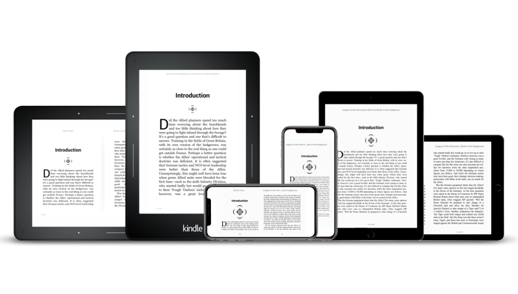
A reflowable format basically means that all of the text in your book will be "responsive" and "re-flow" to fit the dimensions of whatever device it is being viewed on. Some users will want to increase your book's text size or rotate their screen or chose to view it as spreads, single pages or a continuous scroll. Needless to say this ends up negating the need for page numbers in the classic sense of how they are used in traditional printed books.
A fixed layout locks in the exact design and flow of your book. Pages will not shift or "re-flow" and it will essentially look the same on every device. The downside is that this can be very limiting depending on what type of a device you are reading on. Say you are using your mobile phone for reading. The text can become very small if viewed on such a device. Many epublishing services discourage the use of fixed layout ebooks. If your book has a complex layout or a layout with a lot of images and other elements, it may very well be best to avoid creating an ebook out of it. Or, create a version of the book that will work in a reflowable format.
So as you can see, it's more than just copy and paste to design a truly beautiful and readable book interior. A designer needs to consider a host of factors including what device a book will be viewed on. So the next time you open a book, see if you can tell if it's poorly designed or if someone worked their magic.
Book layout design is an art and takes a designer's knowledge of typography, fonts and design principles as well as practical considerations beyond what meets the eye—or shall we say, what will eventually meet the eye. From simple to complex, designing the interior of a book has many moving parts to juggle.


